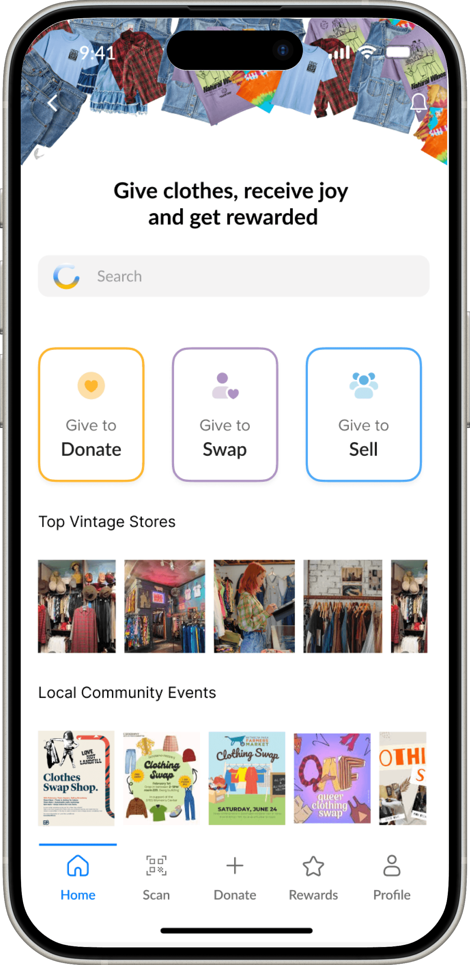
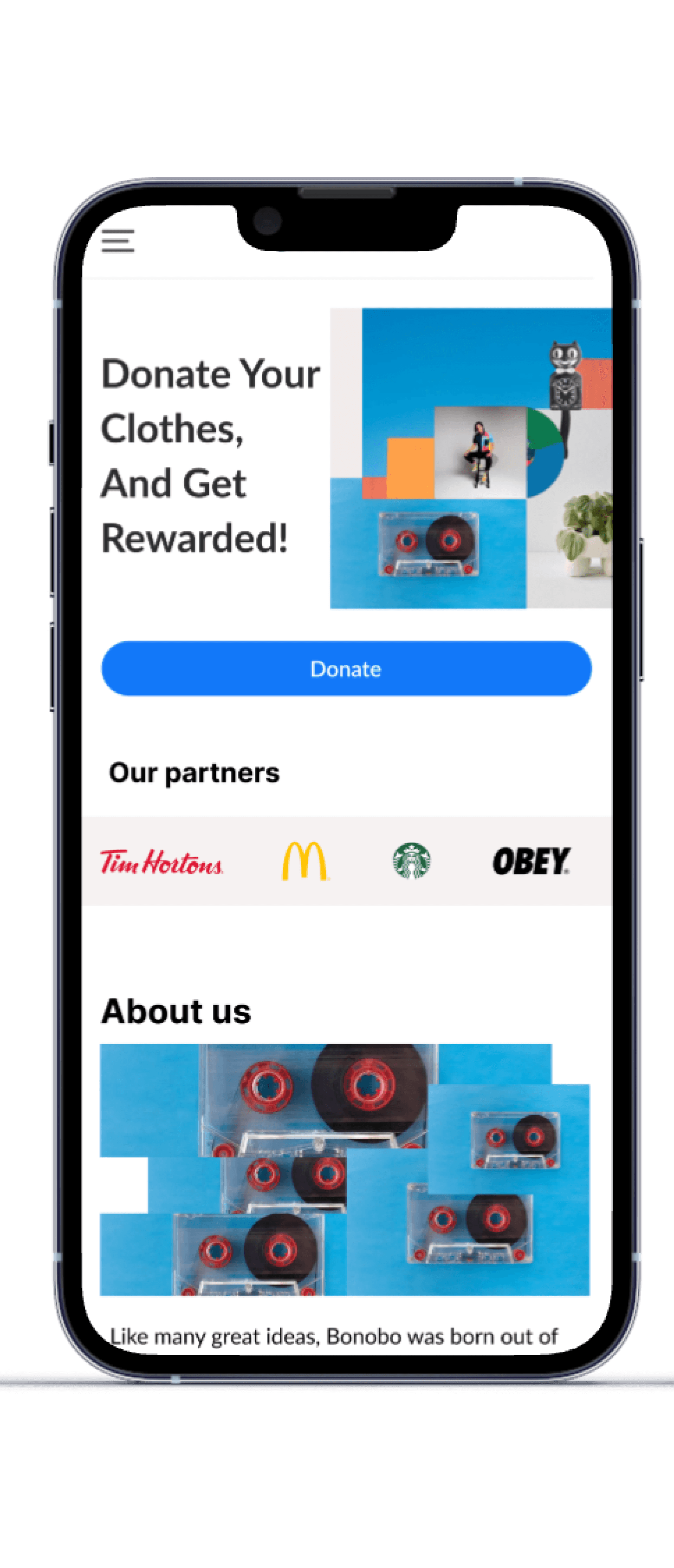
Bonobo is a user-friendly iOS app designed to help Canadians easily donate their unwanted clothes, making it simple and empowering to give back. Donation has never been so easy and rewarding with Bonobo.
Bonobo is a user-friendly iOS app designed to help Canadians easily donate their unwanted clothes, making it simple and empowering to give back. Donation has never been so easy and rewarding with Bonobo.
How might we empower individuals like Melanie to declutter responsibly by offering easy and accessible donation options while rewarding their contributions?
How might we empower individuals like Melanie to declutter responsibly by offering easy and accessible donation options while rewarding their contributions?
The Distracted Declutterer
“I keep telling myself I’ll declutter tomorrow, but tomorrow always feels like it's a day away”.
Vancouver | Graphic Designer | 32 | Single
Has limited time due to demanding work schedule to find and visit drop-off locations.
Procrastinates sorting through clothes to prepare them for donation
Wants to make more space in her tiny living space
Wants to give back to the community
Wants an incentive to get started and take action
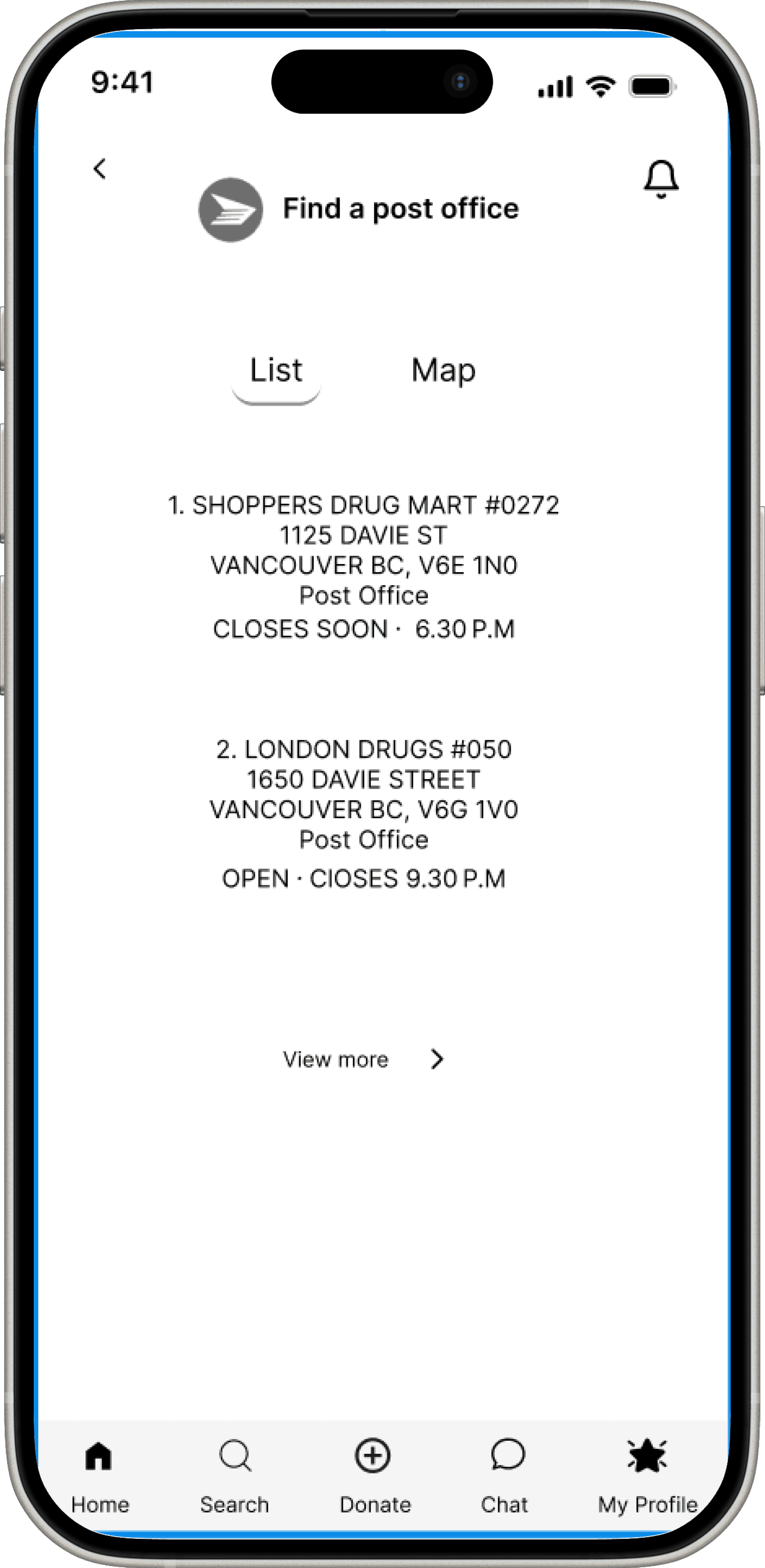
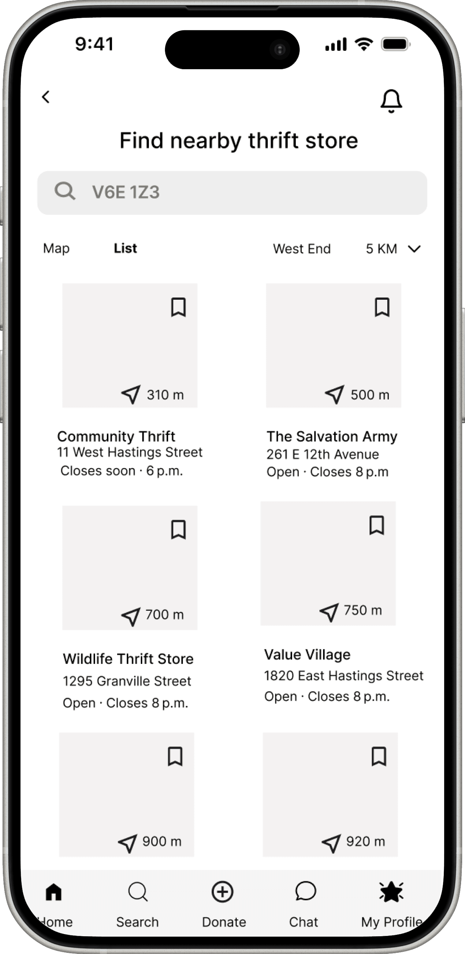
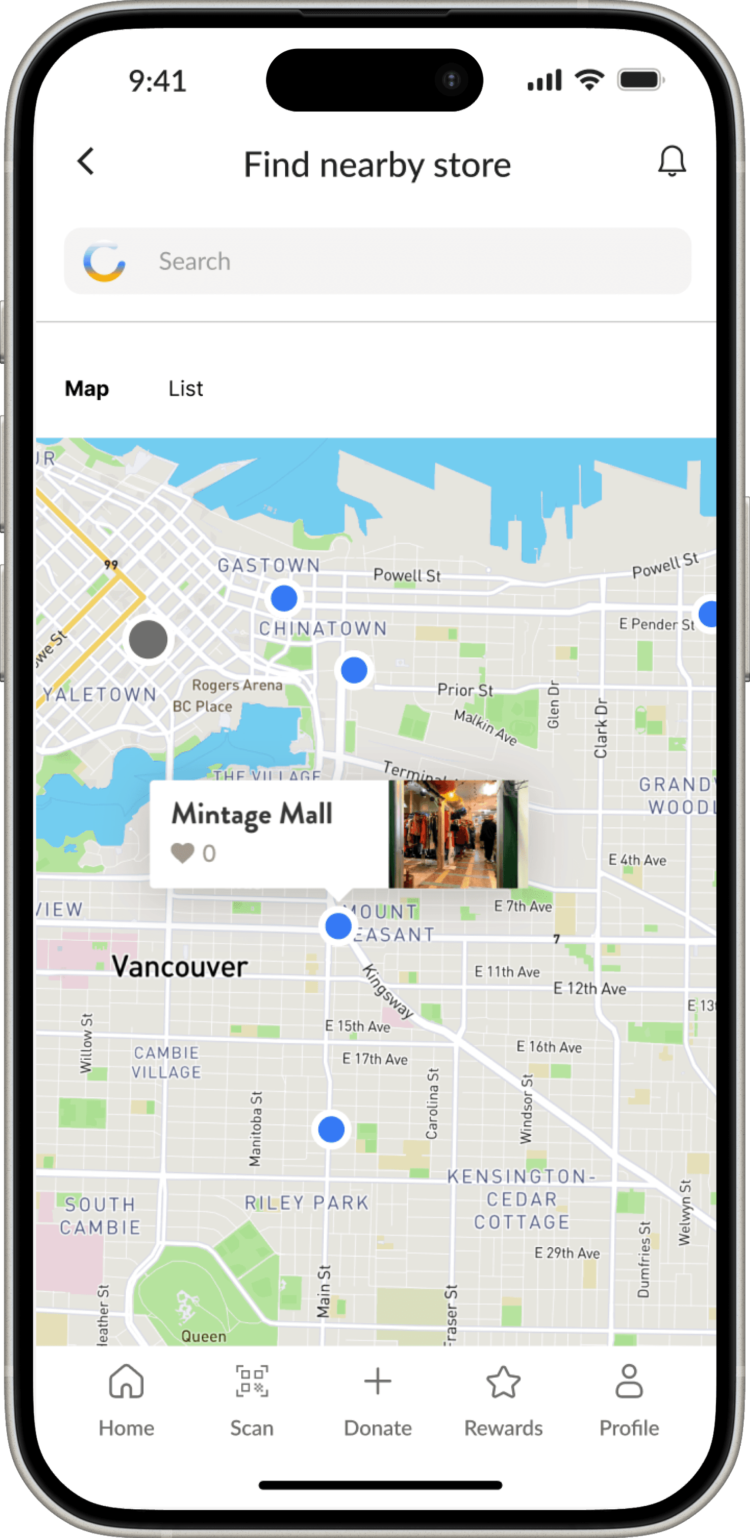
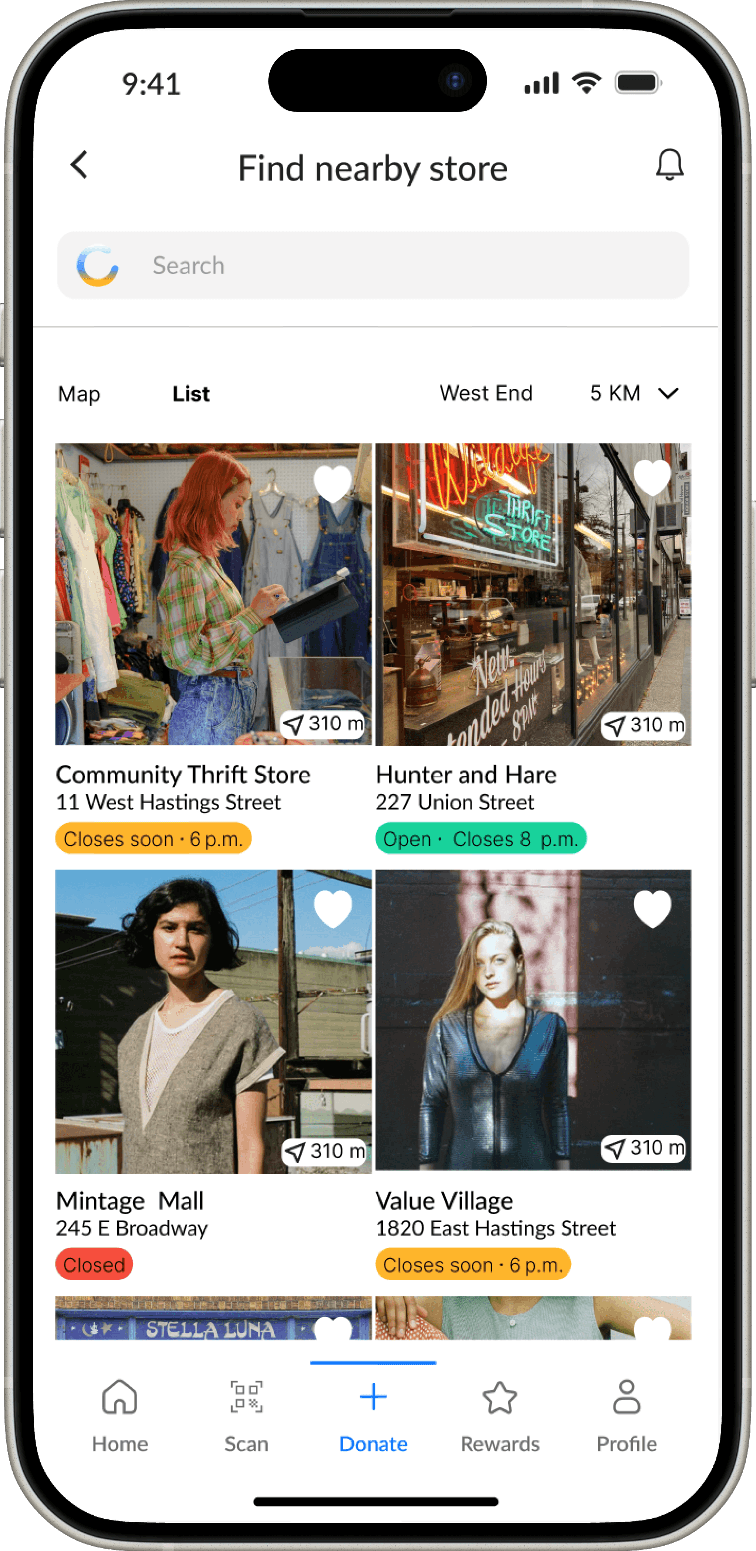
Quick store locator to eliminate long Google search
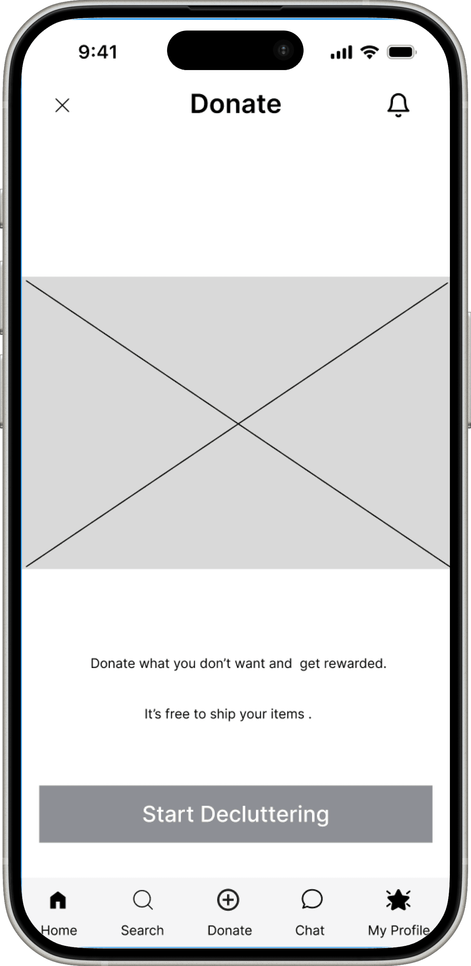
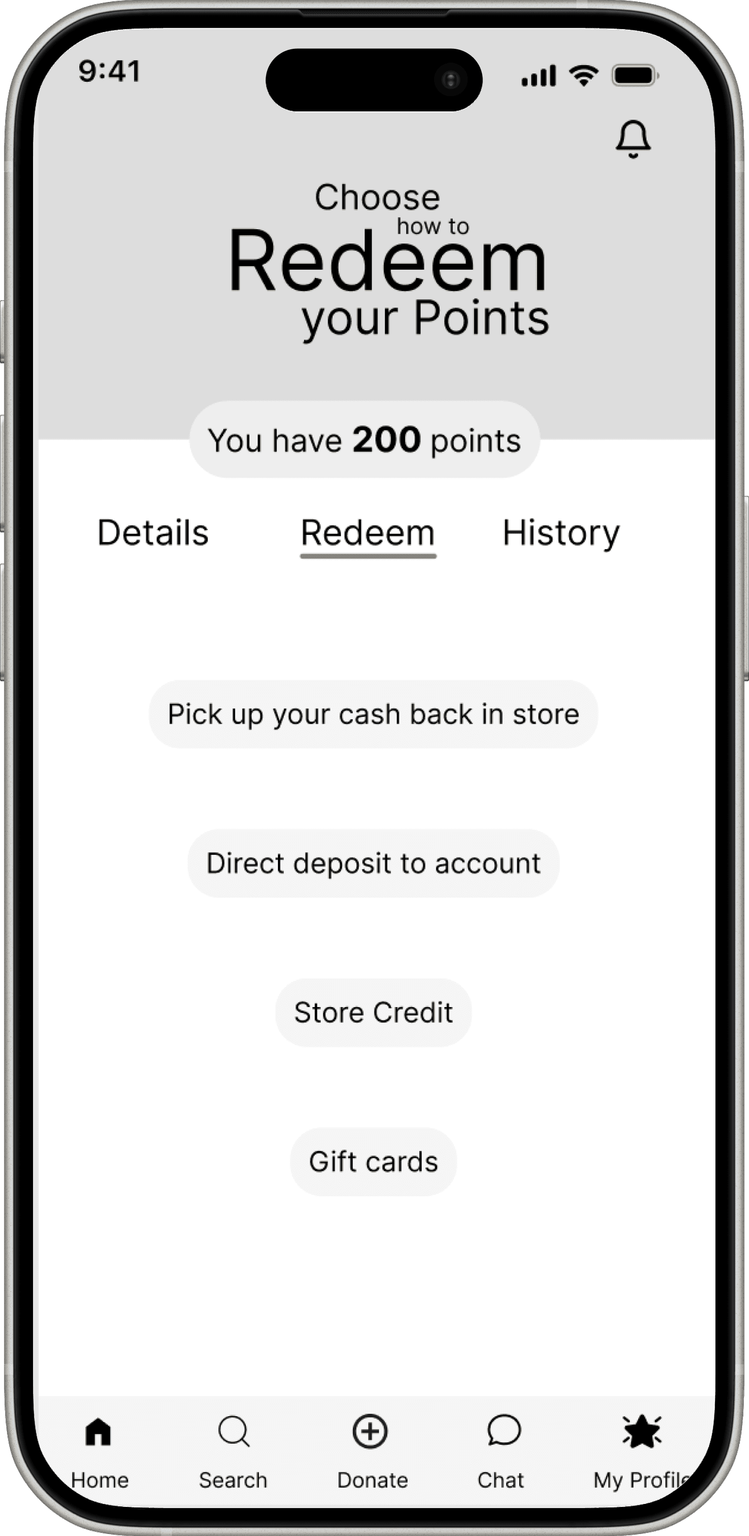
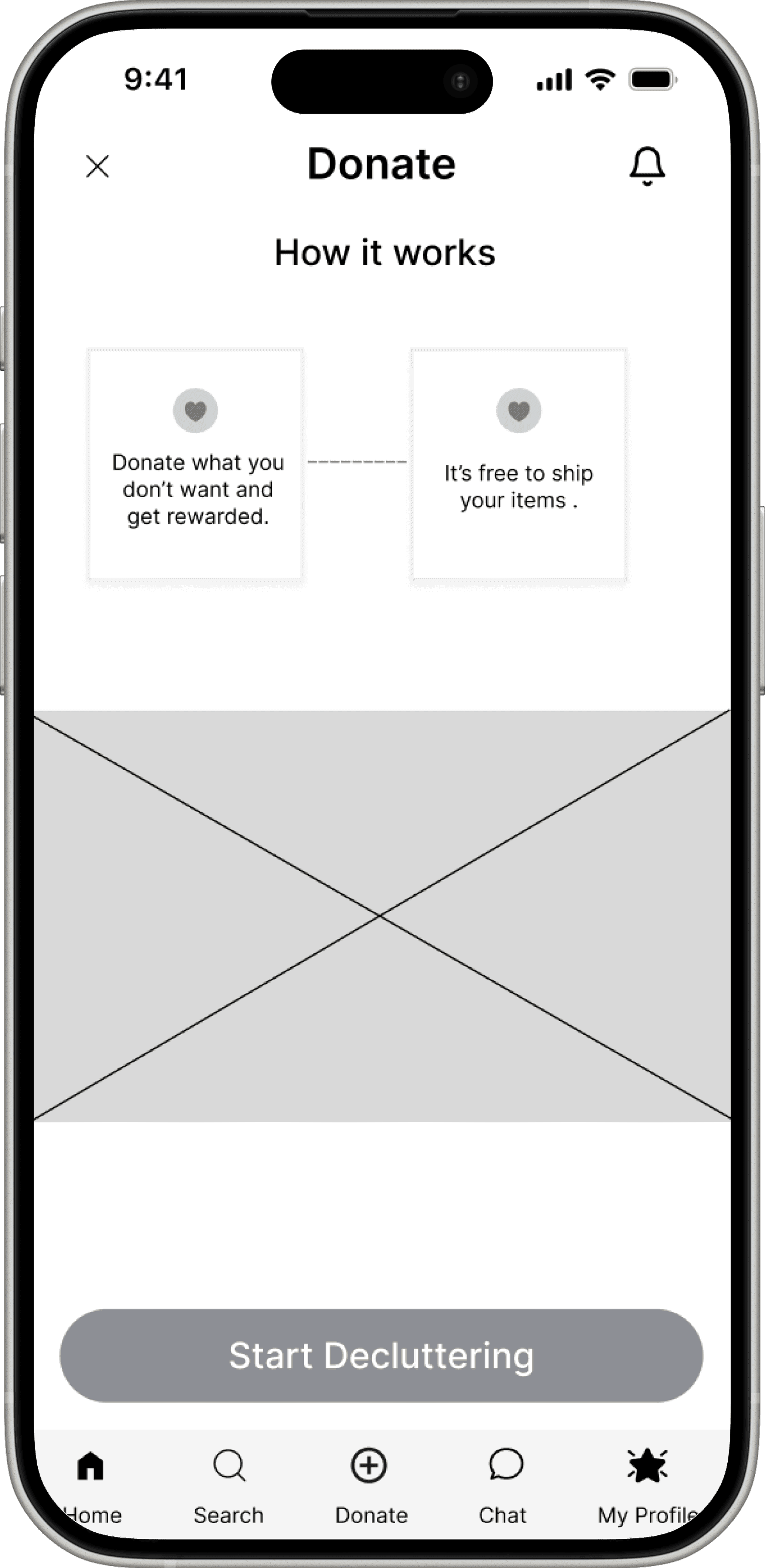
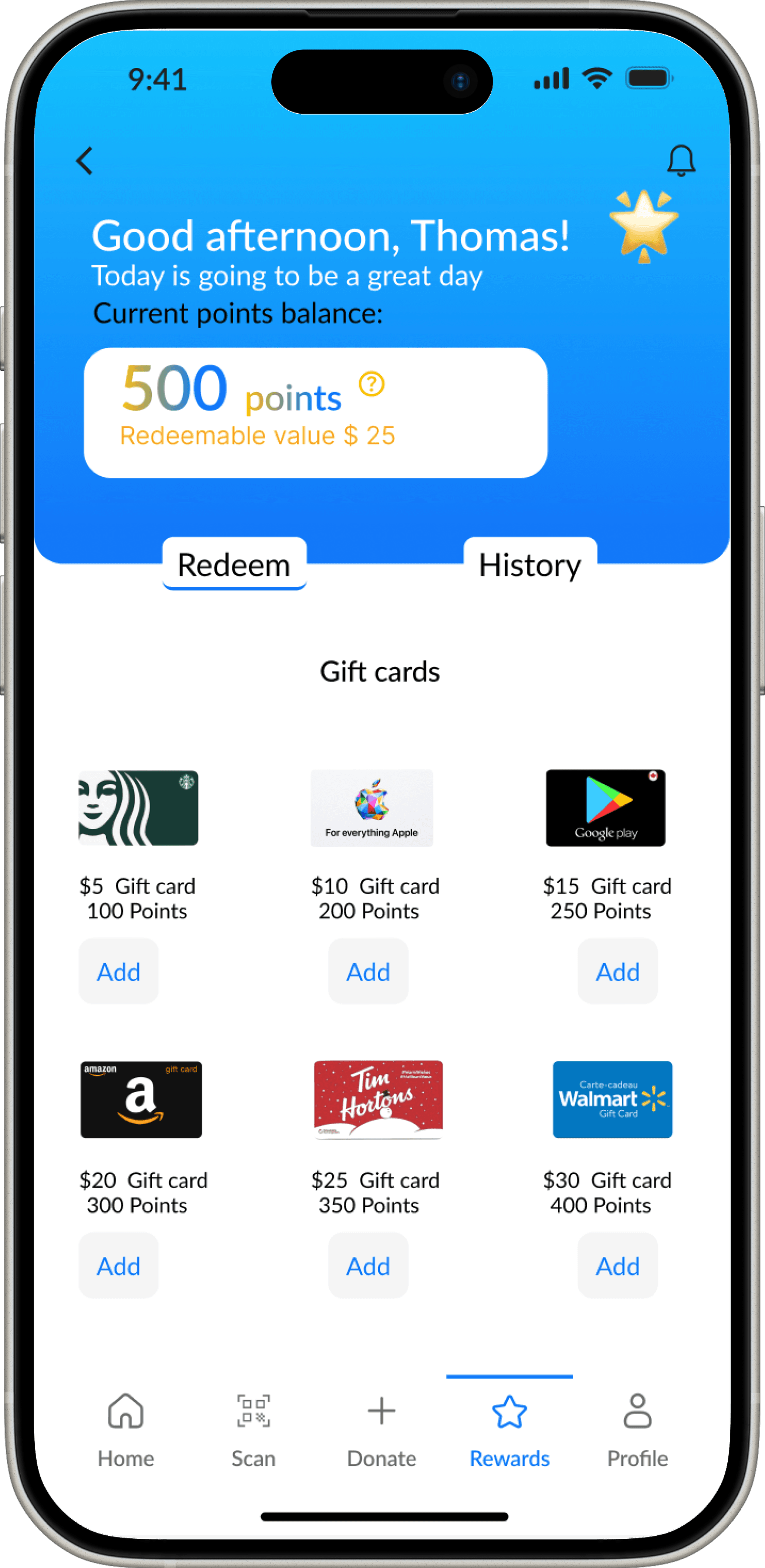
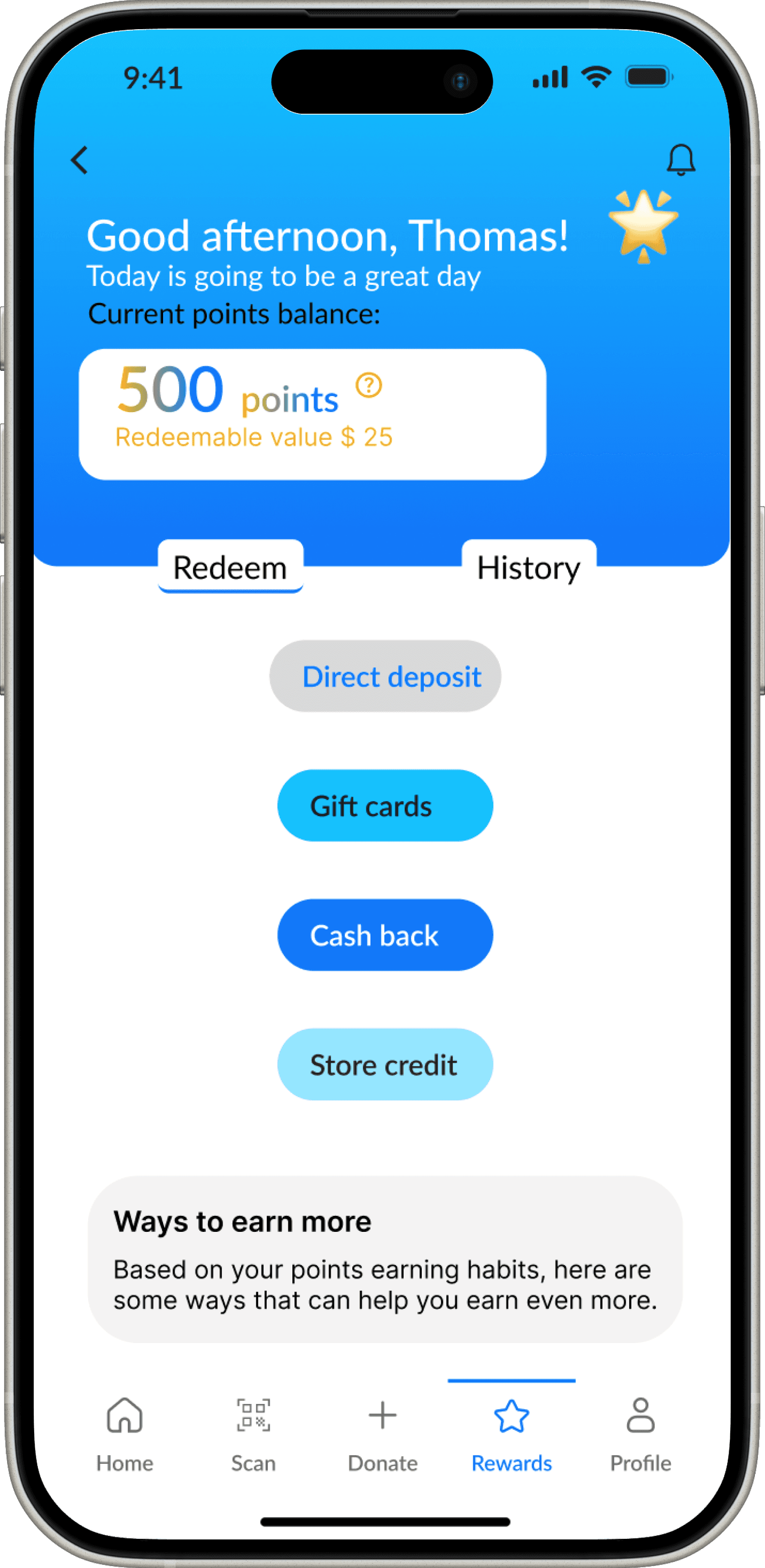
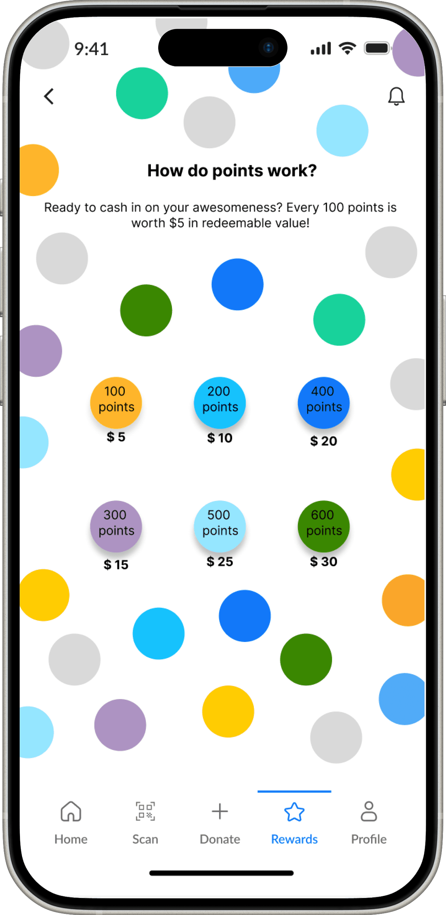
There’s something in it for you!
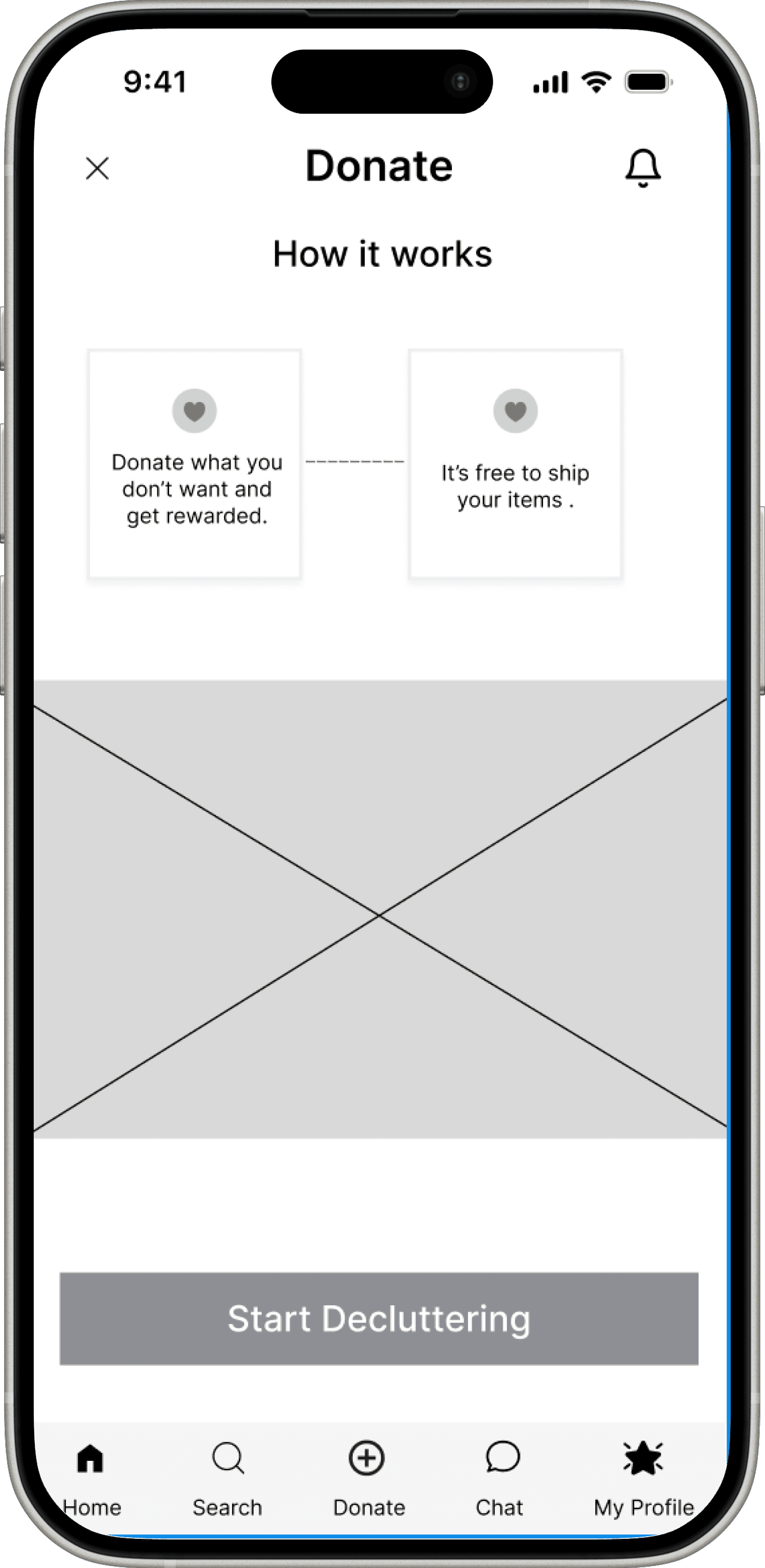
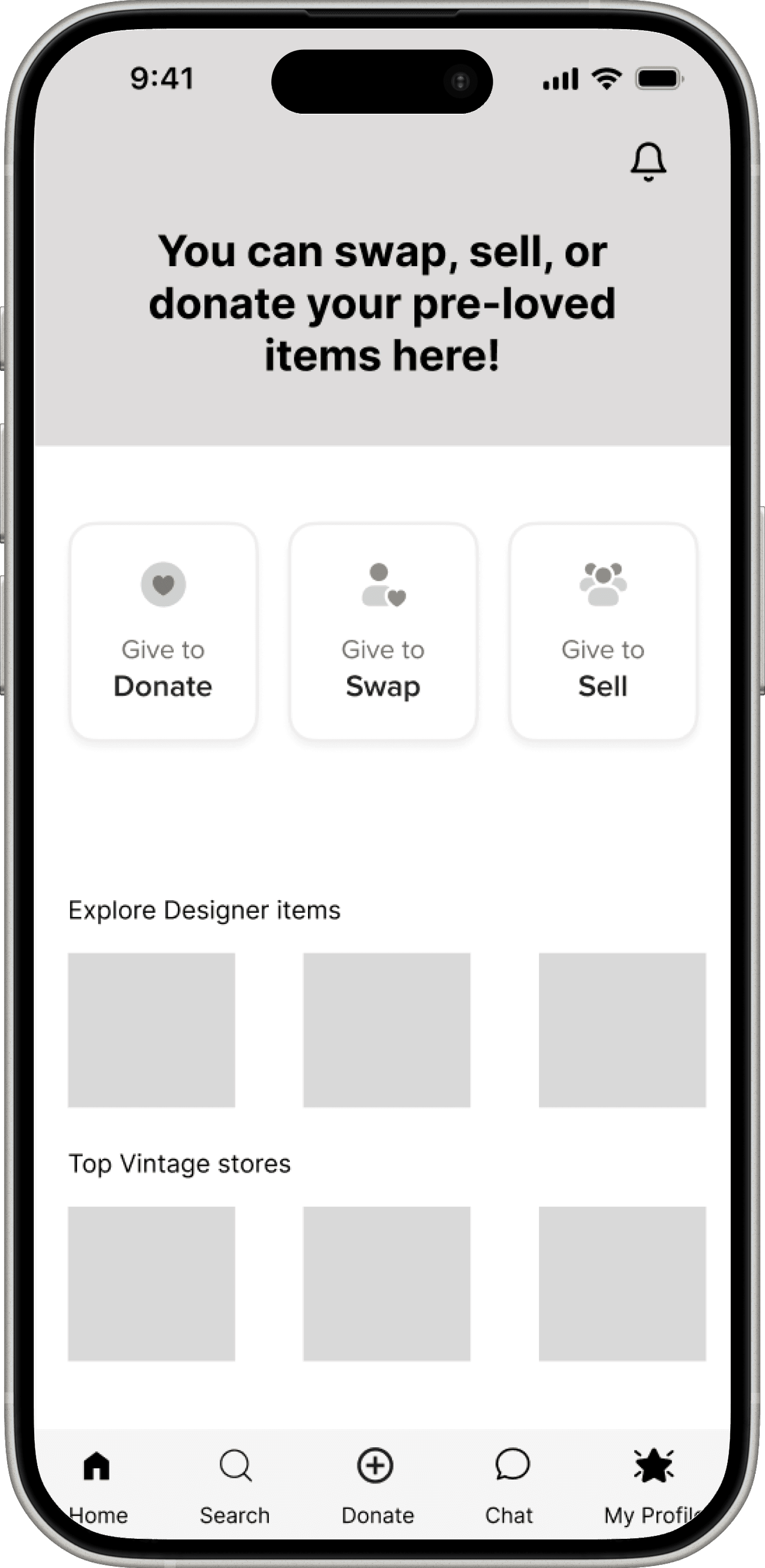
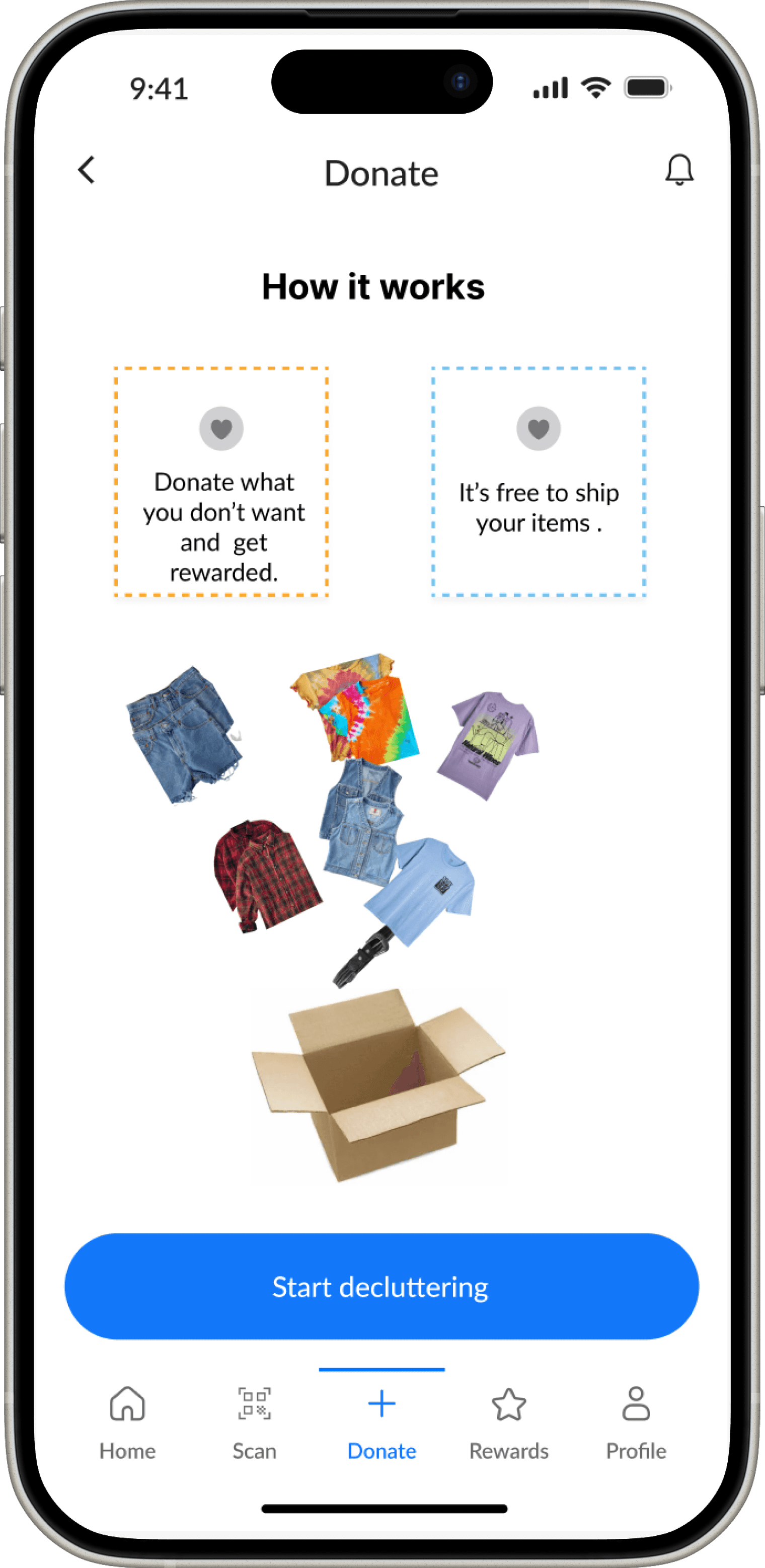
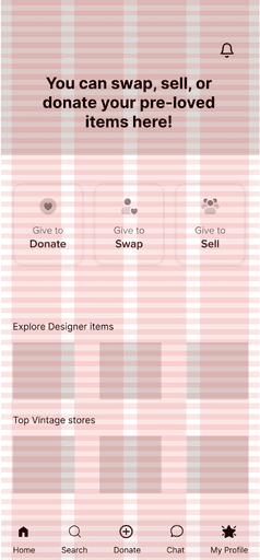
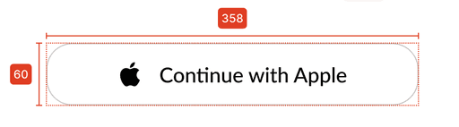
Choose how you want to donate
Choose how you want to donate
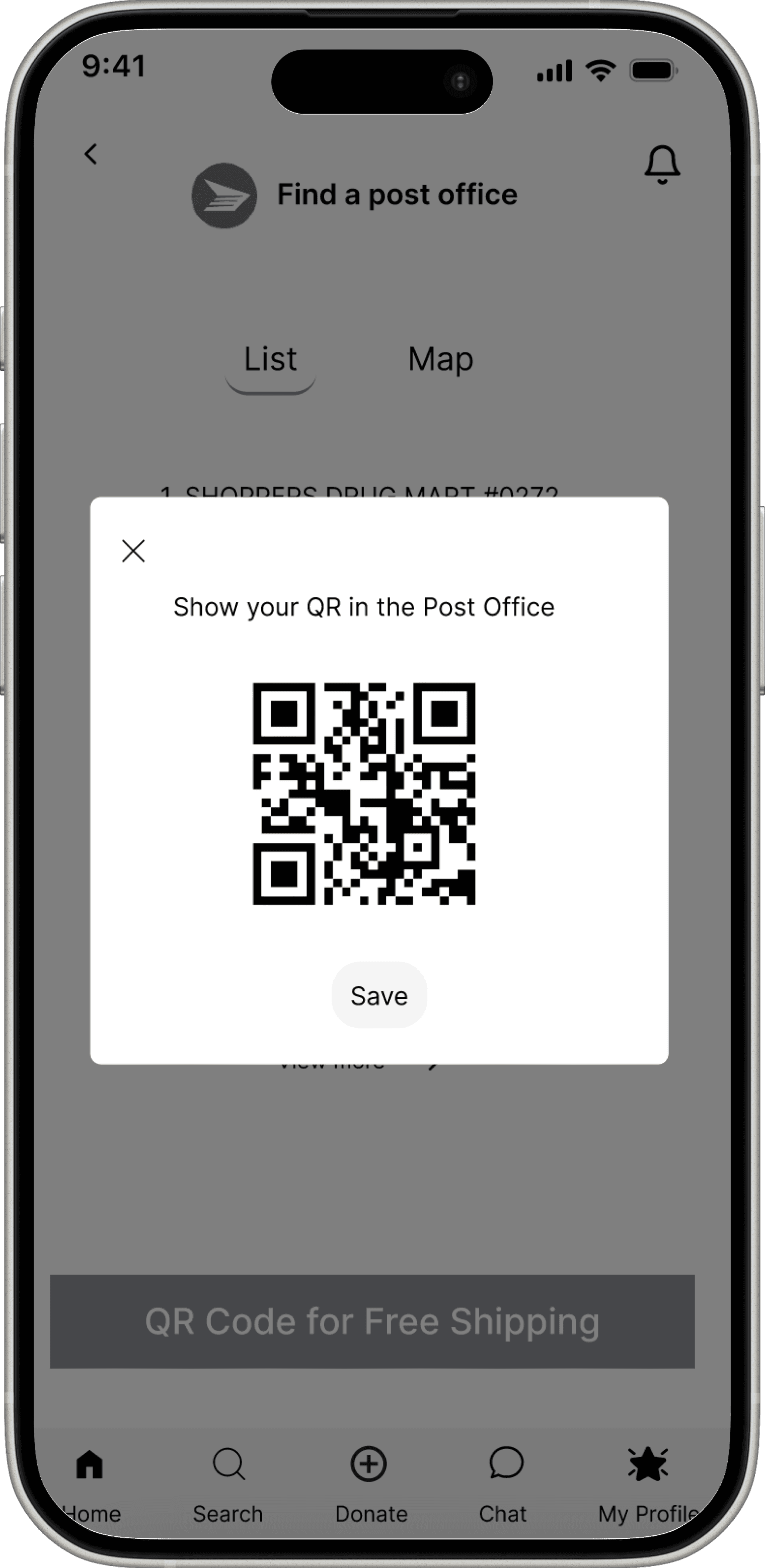
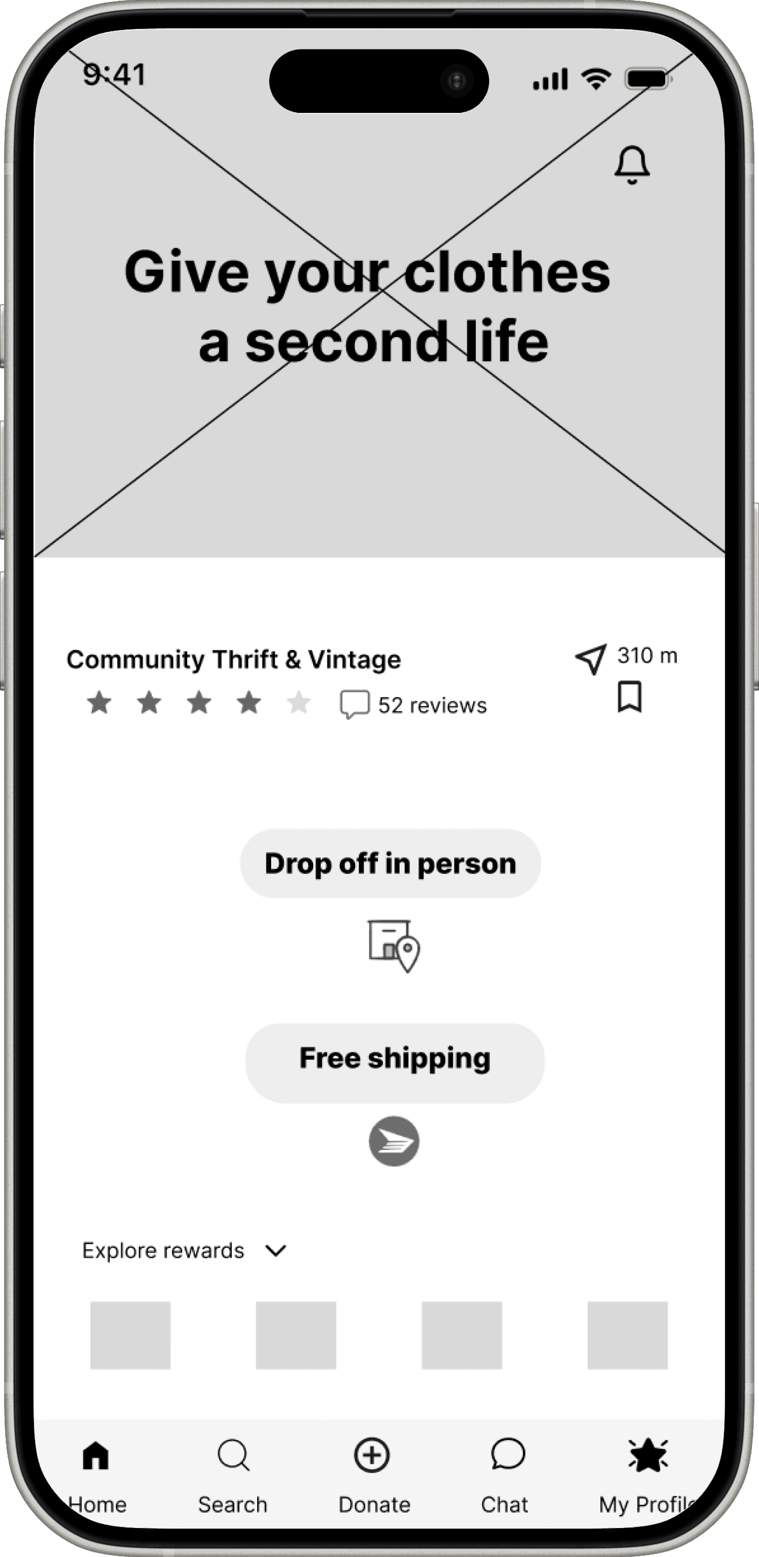
Added a CTA "QR Code for Free Shipping"
for users to download and show in the post
office
No "QR Code " as a follow up
to confirm the shipping is Free
Made the picture smaller for less distraction
Moved the 2 clear steps of how to donate
from the bottom to the top
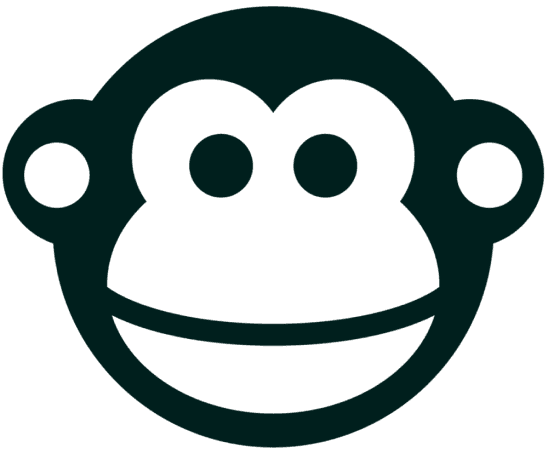
I tried creating grayscale word marks, as well as colourful ones. I selected the app icon to symbolize a Bonobo since Bonobos are communal, fun-loving, and enjoy sharing.
I created grayscale word marks, as well as colourful ones to get an idea
of the final one that I want to stick with.
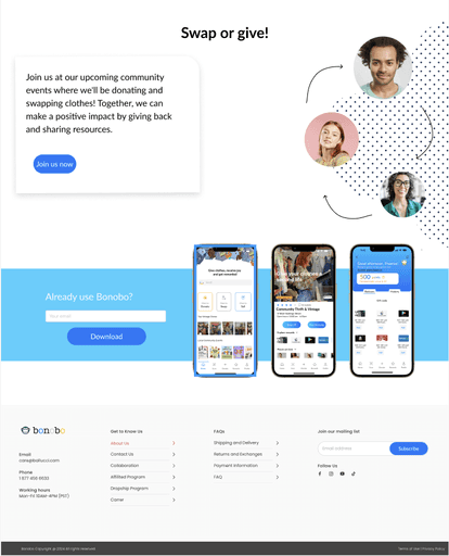
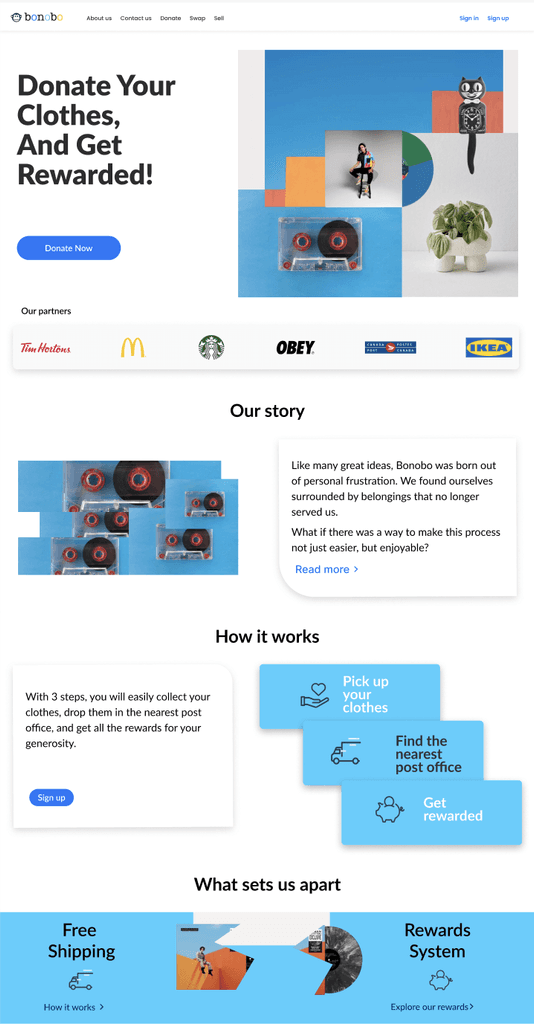
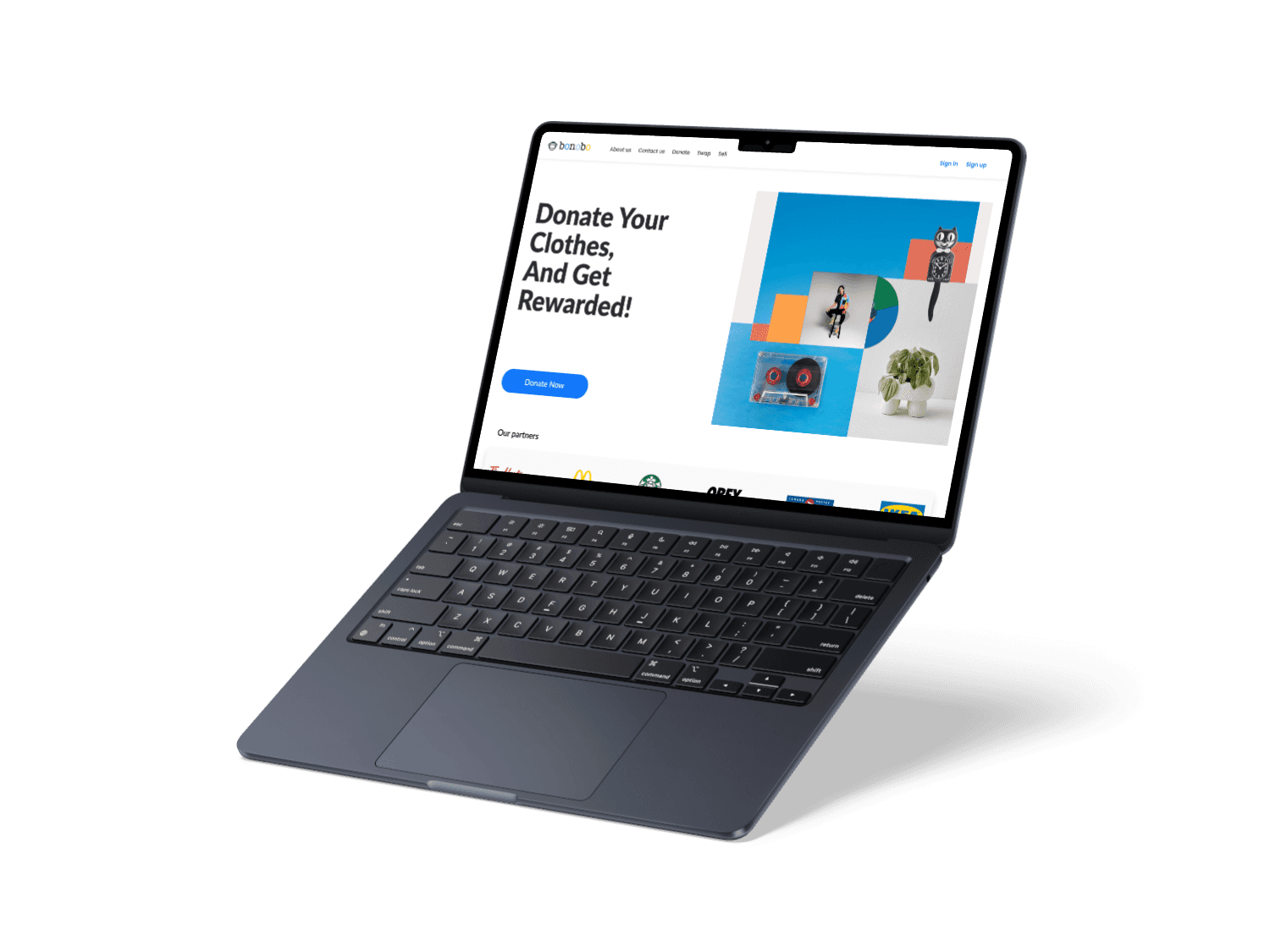
I used the same approach as with my app creation to design my product's promotional website suitable for two devices. I crafted a flexible layout for a 16” MacBook and an iPhone
13 Pro.
I used the same approach as with my app creation to design my product's promotional website suitable for two devices. I crafted a flexible layout for a 16” MacBook and an iPhone
13 Pro.
The Double Diamond Design Process
The Double Diamond Design Process
In this project, I used the Double Diamond design process to identify the core problem through divergent thinking. I explored a number of ideas before converging on the final solutions, making sure the end result of the high-fidelity digital solution aligned with user needs.
Image source: Unsplash
In this project, I used the Double Diamond design process to identify the core problem through divergent thinking. I explored a number of ideas before converging on the final solutions, making sure the end result of the high-fidelity digital solution aligned with user needs.
Image source: Unsplash
What's so hard about donating clothes?
What's so hard about donating clothes?
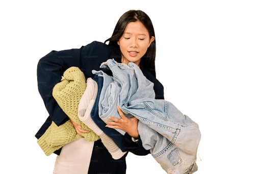
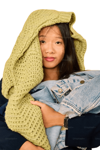
The fashion industry generates immense waste, with a significant portion coming from discarded clothing. Despite good intentions, many Canadians find it inconvenient to donate clothes due to lack of time to organize and pack items for donation. On top of that, there's a lot of uncertainty about where and how to donate clothes responsibly.
This leads to perfectly usable garments ending up in landfills, contributing to environmental degradation.
Image source: Unsplash
of fabric every year that could be reused.
The average North American purchases
before discarding of them
than 15 years ago and keeps them
only half as long
“Sometimes I have a heavy bag and it’s hard to carry it to the thrift stores, and I don’t have a car”.
“Trying to drop off my donations across town feels like training for a spontaneous marathon!”
“If there were incentives like discounts or coupons, it would definitely motivate me to carve out the time!!!”.
“I’d be more inclined to donate my clothes if there was a “free coffee” with every bag of donation!”
Establishing the Target User
Establishing the Target User
I created a persona, named Melanie, that represents the core attributes of my target audience.
Interviews: What Canadian residents in BC had to say
Interviews: What Canadian residents in BC had
to say
My happy accidents to find my way to "genius"
My happy accidents to find my way to "genius"
I took inspiration from competitors like "Karrot", "Kjiji", and "Depop" to get ne started on Home,
Donate and Rewards Screens.
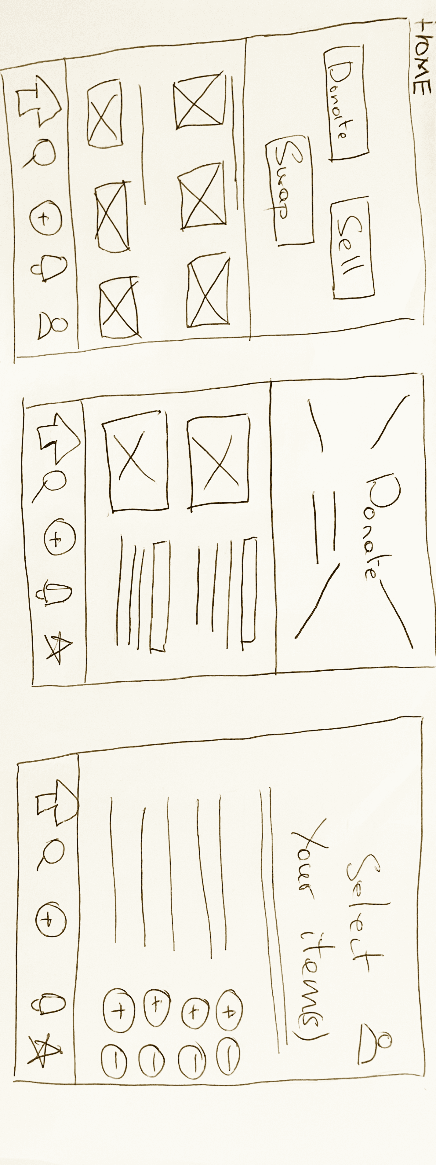
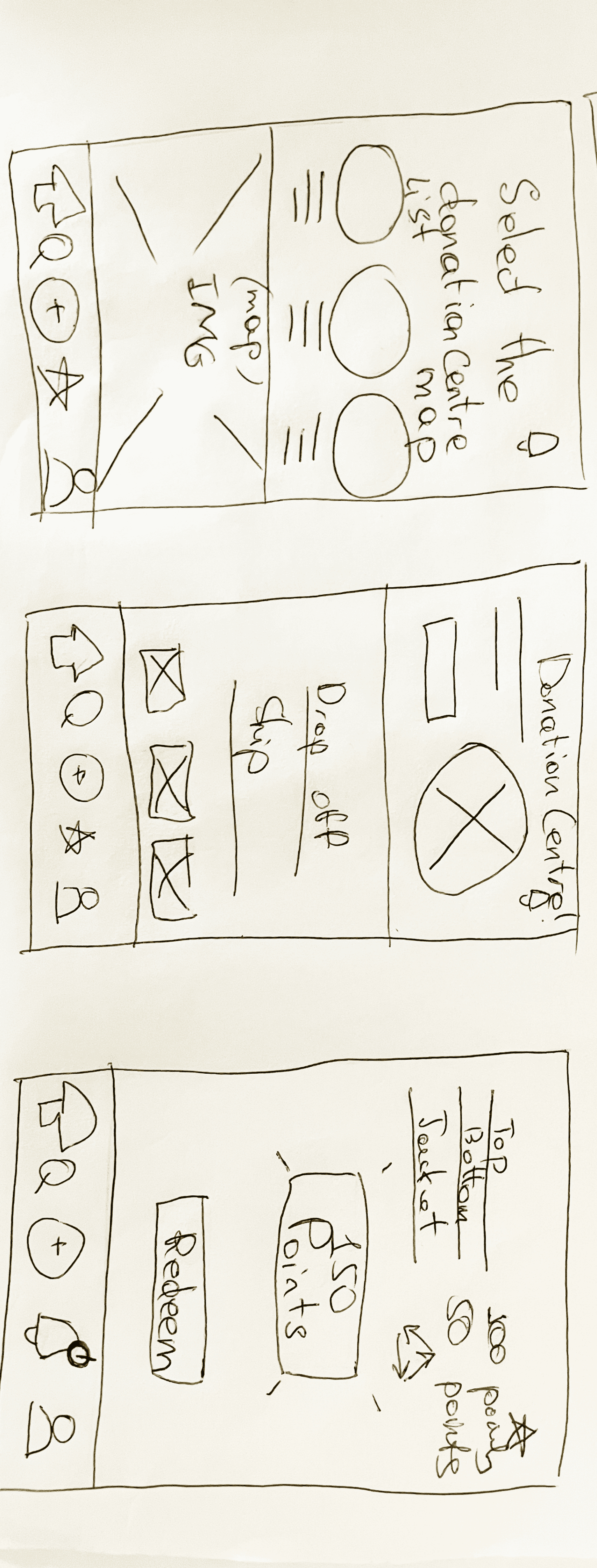
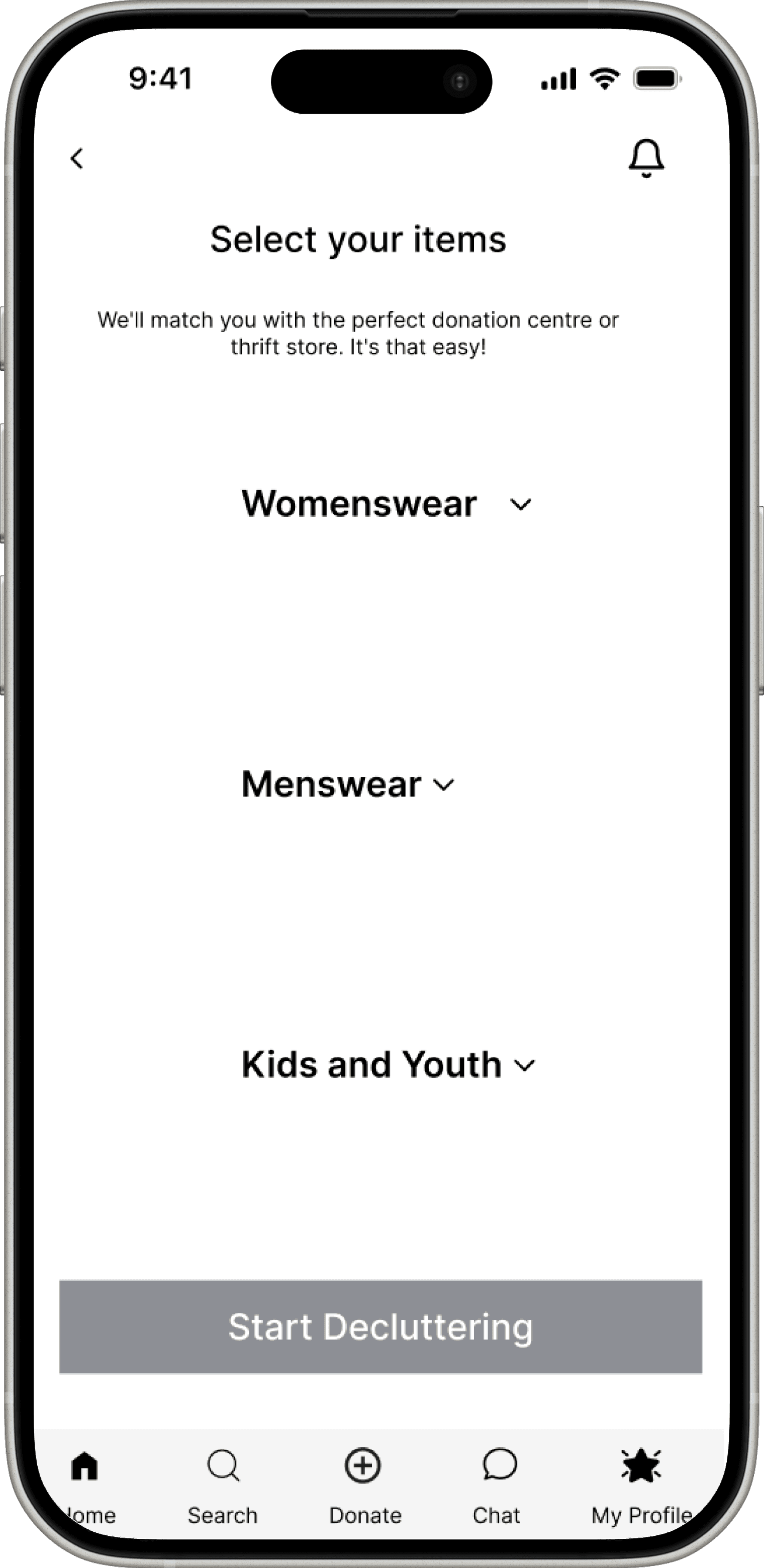
Clothing Item Selection Screen
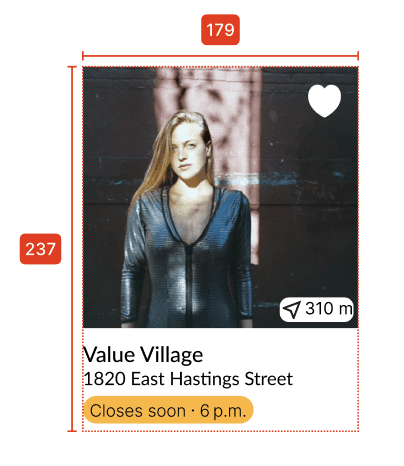
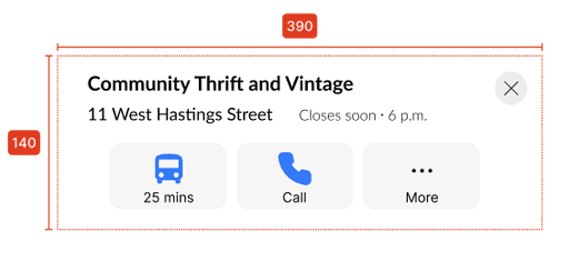
Donation centre
locator screen
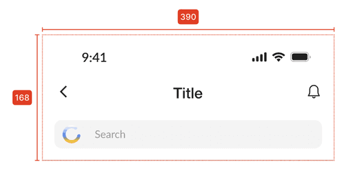
Choose how to
donate Screen
Where ideas are born and refined before they’re "dressed to impress"
Where ideas are born and refined before they’re
"dressed to impress"
Based on my solution sketches, I could start designing low-fidelity greyscale wireframes.
Getting feedback from users
Getting feedback from users
I conducted user testing with 5 participants to gather real-time feedback on completing the tasks.
I conducted user testing with 5 participants to gather real-time feedback on completing the tasks.
Sketching out the real deal in a playful way
Sketching out the real deal in a playful way
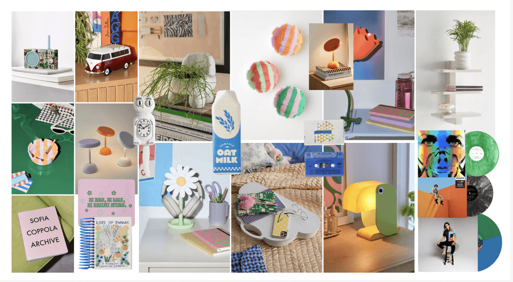
I've compiled an group of images and designs to communicate the feel of the app.
I've compiled an group of images and designs to communicate the feel of the app.
Exploring Wordmarks and App Icons
Exploring Wordmarks and App Icons
UI Library (Typography, Grids, Atoms, Molecules, etc.)
I chose Lato as the brand typeface for its modern and clear aesthetic which enhances readability across digital platforms.
I chose Lato as the brand typeface for its modern and clear aesthetic which enhances readability
across digital platforms.
My role: UX researcher, UX/UI designer
Duration: 12 weeks, Apr-Jul 2024
Tools: Figma, Otter.ai, Notion
Count: 4
Type: Stretch
Width: Auto
Margin: 16
Gutter: 20
Count: 4
Type: Stretch
Width: Auto
Margin: 16
Gutter: 20
Count: Auto
Type: Top
Height: 8
Offset: 0
Gutter: 8
Count: Auto
Type: Top
Height: 8
Offset: 0
Gutter: 8
No "QR Code " as a follow up
to confirm the shipping is Free
Picture distracts from reading
about the 2 steps of how to
donate
Picture distracts from reading
about the 2 steps of how to
donate
My role: UX researcher, UX/UI designer
Duration: 12 weeks, Apr-Jul 2024
Tools: Figma, Otter.ai, Notion
Made the picture smaller for less distraction
Moved the 2 clear steps of how to donate
from the bottom to the top
Added a CTA "QR Code for Free Shipping"
for users to download and show in the post
office
Blue for trust, dependability, and genuineness
Orange to spark energy and amiability, positivity, taking action
Light blue to making sure the app feels approachable and user-friendly
Blue for trust, dependability, and genuineness
Orange to spark energy and amiability, positivity, taking action
Light blue to making sure the app feels approachable and user-friendly
Quick store locator to eliminate long Google search
There’s something in it for you!
Click here for the
final design